Simple responsive pure CSS Image Gallery
Hi there, today I’m going to show you my brand new responsive Image gallery. As a developer myself, I have found that every time I need to create a simple gallery, I have to either start from scratch or use something that is overloaded with tons of functionality that I won’t be using. To avoid dealing with this, I have created my own simple Gallery, that allows to list images in an easy way, and define how do you want them to look across different resolutions.
The first thing that I think its relevant to notice, its that this code will work with any tags, as long as we respect the class names on the elements, and the order of them. For this example, I’m going to use UL and Li elements, but the same thing can be accomplished using any other proper tags for the matter.
This gallery its created using percentages, which makes it look good across resolutions, and also when included among other elements, or when the space for it is not the full with of the screen, as the fluid design of the gallery, will allow it to work perfect anyway.
The classes:
.image-gallery : This class should be added to the content of our gallery.
.gallery-item : This class defines an item inside of our gallery
Using this two classes by themselves will not result in a final gallery, for this, we still need to give some direction to our code, using extra classes to define the amount of items that we want our gallery to show per line, for instance, by adding the class .desktop-cols-2 to the parent .image-gallery we are defining that our gallery will be split in two columns, showing all the items (.gallery-item) with this format.
Available classes to control the amount of columns to render:
- .desktop-cols-1 : Default single column gallery
- .desktop-cols-2 : 2 column gallery
- .desktop-cols-3 : 3 column gallery
- .desktop-cols-4 : 4 column gallery
- .desktop-cols-5 : 5 column gallery
- .desktop-cols-6 : 6 column gallery
- .desktop-cols-7 : 7 column gallery
- .desktop-cols-8 : 8 column gallery
- .desktop-cols-9 : 9 column gallery
- .desktop-cols-10 : 10 column gallery
- .desktop-cols-11 : 11 column gallery
- .desktop-cols-12 : 12 column gallery
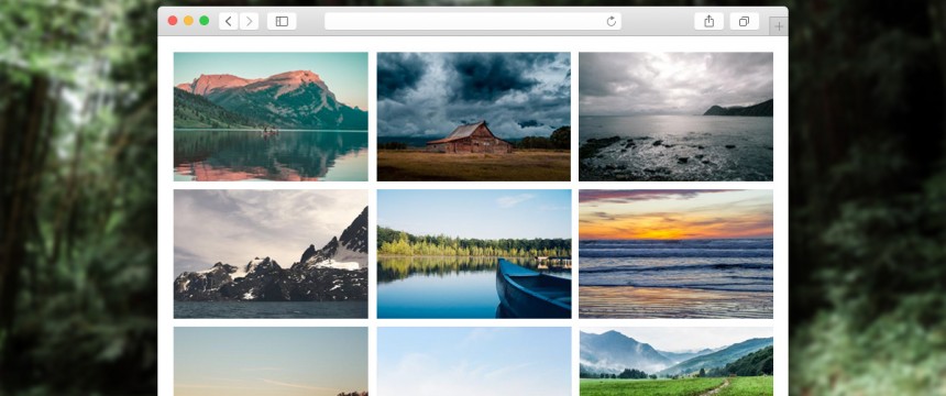
Example
Here you can see a simple functional example, and you can also download the code if you want.
Responsive breakpoints:
As seen before by adding the class .desktop-cols-(n) we can control the amount of columns render on our gallery, but so far, we have only defined said amount for desktop resolutions, and even when the gallery its still fluid, its not responsive. For this, we need to add particular classes, to define the amount of columns that we want to see for lower resolutions.
For devices with a max-width of 1024px
.tablet-cols-(n) : This will overwrite the desktop definitions, once the max width of the device its 1024px. In this example, n can be any number between 1 and 12. This classes are built to target tablet devices.
For devices with a max-width of 767px
.mobile-cols-(n) : This will overwrite the desktop definitions, and tablet definitions (if there are any) once the max width of the device its 767px. In this example, n can also be any number between 1 and 12. This classes are built to target mobile devices.
All this classes can live together on the same element, and the CSS structure contemplates this, it will give preference to the definition that matches the resolution of the device that I’m using, really similar to how Bootstrap selectors work.
I hope this can help someone else to avoid dealing with coding a gallery every time they encounter one on the designs or specs, and of course that if there is anything that you might consider I could do better here, fell free to comment about it, I’d love to hear what you guys think, and improve this simple gallery as much as it needs to.
See you next time!